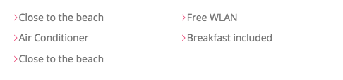
The implementation in CSS or with an collection of SVGs in a sprite file
Implementation in CSS
1. We create a ::before Element with background-color
 &__item::before{
        content: "";
        display: inline-block;
        height:1rem;
        width: 1rem;
        fill: var(--color-primary);

        background-color: var(--color-primary);
    }
2. We mask the SVG, so only the SVG will appear in the background-color
&__item::before{
        content: "";
        display: inline-block;
        height:1rem;
        width: 1rem;
        fill: var(--color-primary);

        background-color: var(--color-primary);

        //Newer Browser
        // -webkit-mask-image: url(../img/chevron-thin-right.svg);
        // -webkit-mask-size: cover;
        // mask-size: cover;

        //Older Browsers
        // background-image: url(../img/chevron-thin-right.svg);
        // background-size: cover;
    }
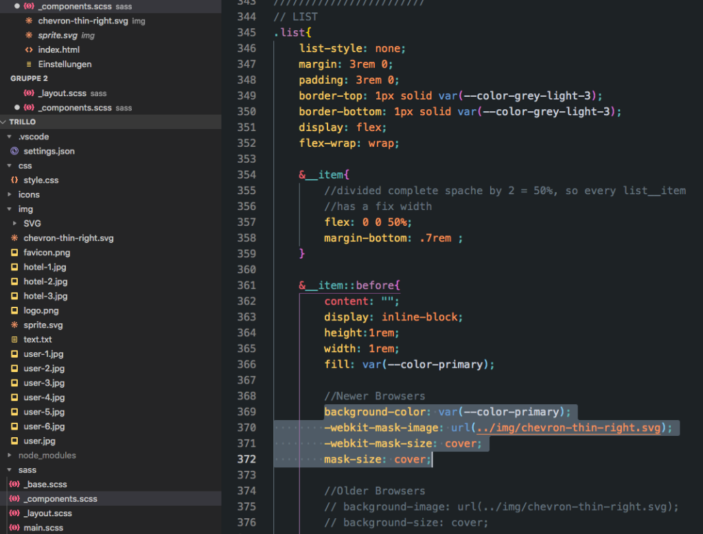
////////////////////////
// LIST
.list{
list-style: none;
margin: 3rem 0;
padding: 3rem 0;
border-top: 1px solid var(--color-grey-light-3);
border-bottom: 1px solid var(--color-grey-light-3);
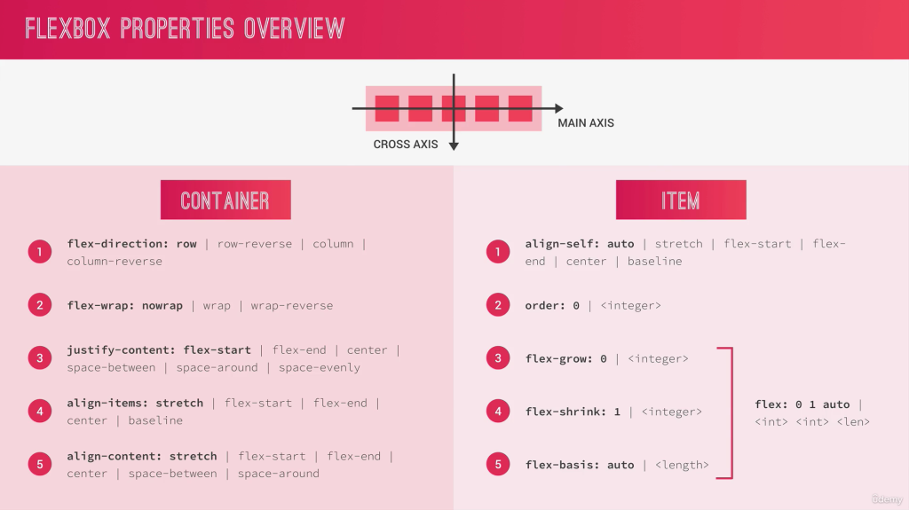
display: flex;
flex-wrap: wrap;
&__item{
//divided complete space by 2 = 50%, so every list__item
//has a fix width
flex: 0 0 50%;
margin-bottom: .7rem ;
}
&__item::before{
content: "";
display: inline-block;
height:1rem;
width: 1rem;
fill: var(--color-primary);
//Newer Browsers
background-color: var(--color-primary);
-webkit-mask-image: url(../img/chevron-thin-right.svg);
-webkit-mask-size: cover;
mask-size: cover;
//Older Browsers
// background-image: url(../img/chevron-thin-right.svg);
// background-size: cover;
}
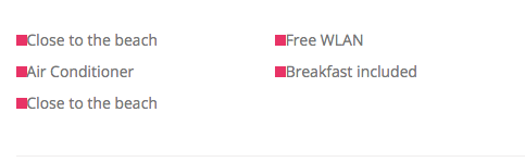
}Implementation as Sprite file
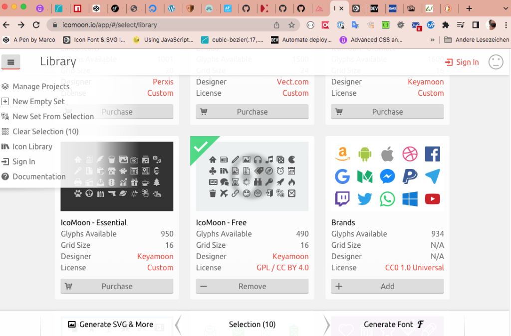
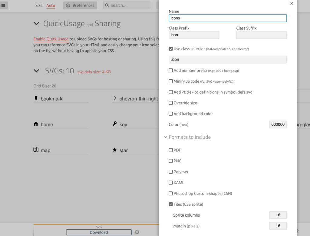
Create a sprite file with icomoon.io and export it as sprite file.
1. Create svg Element in html document
       <div class="overview__stars">
            <svg class="overview__icon-star">
              <use xlink:href="img/sprite.svg#icon-star"></use>
            </svg>
            <svg class="overview__icon-star">
              <use xlink:href="img/sprite.svg#icon-star"></use>
            </svg>
            <svg class="overview__icon-star">
              <use xlink:href="img/sprite.svg#icon-star"></use>
            </svg>
            <svg class="overview__icon-star">
              <use xlink:href="img/sprite.svg#icon-star"></use>
            </svg>
            <svg class="overview__icon-star">
              <use xlink:href="img/sprite.svg#icon-star"></use>
            </svg>
        </div>
2. Set Element size and fill with color
    &__icon-star{
        width: 1.75rem;
        height: 1.75rem;
        fill: var(--color-primary);
    }
3. All 5 SVG Elements filled with color