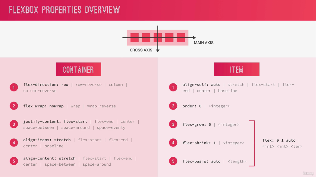
Container Properties
Main-Axis: set the direction of elements
Cross-Axis: set the position of elements
Flex-Container
Direction
display: flex
flex-direction: row (x axis from left to right)
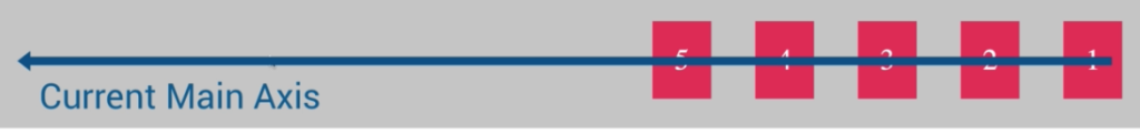
flex-direction: row-reverse (skip direction on x axis from right to left)
flex-direction: column;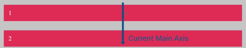
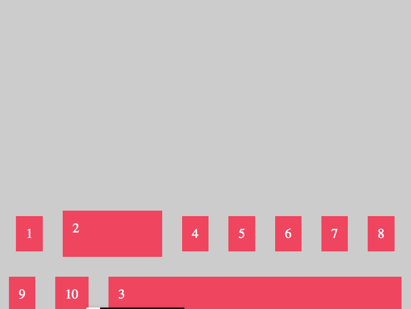
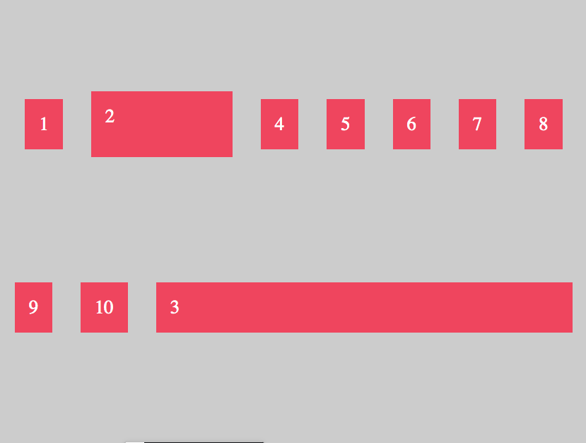
Container Elements on X-Axis
//Justify Elements in Container
justify-content: center;


Spaces between the same
Same Space between Elements no space on left/right conter border
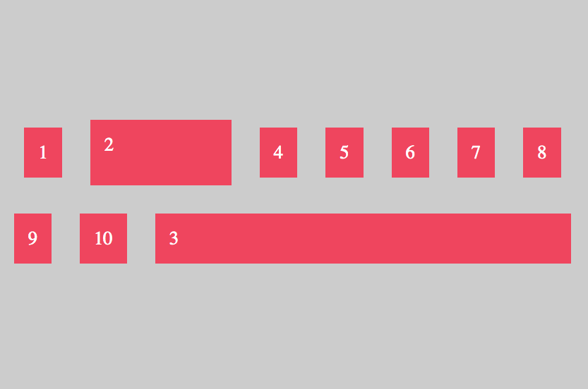
//Justify Elements in Container
justify-content: space-between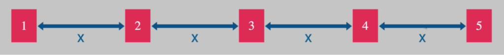
Spaces around 1 and double Size inside
Doubles Spaces between inside Elements
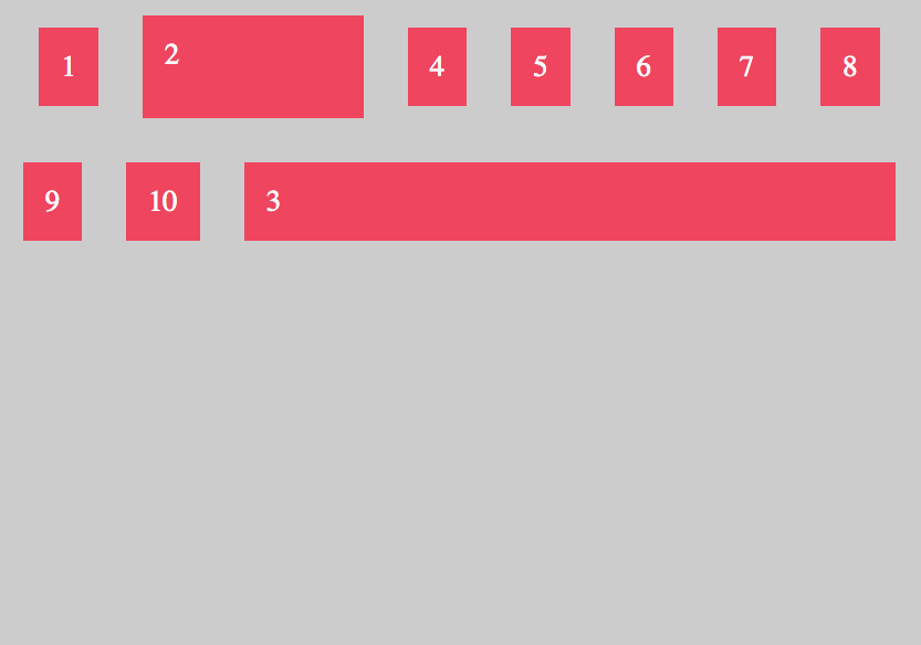
//Justify Elements in Container
justify-content: space-around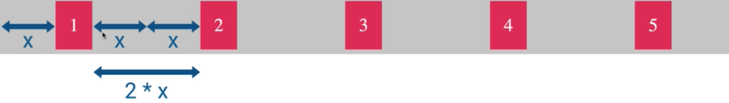
Spaces overall equal
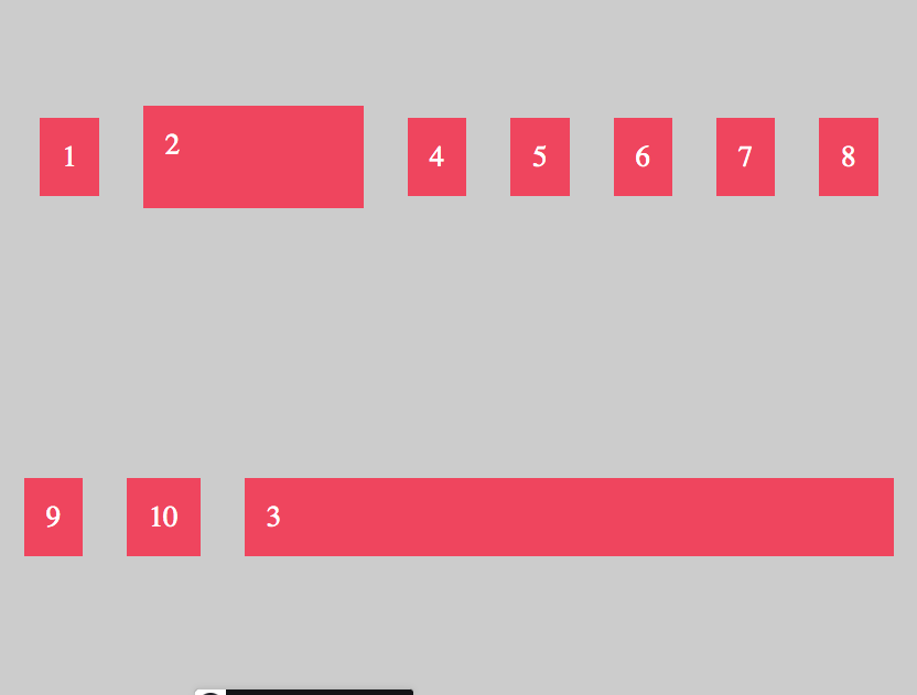
//Justify Elements in Container
justify-content: space-evenly
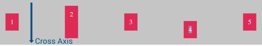
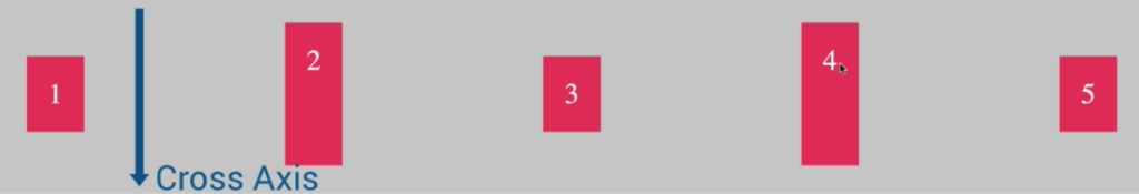
Container Elements on Y-Axis
Centering on Y-Axis on the biggest Element here Number 2,
align-items: center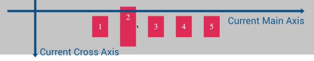
align-items: flex-start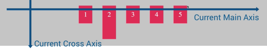
align-items: flex-end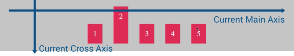
align-items: stretch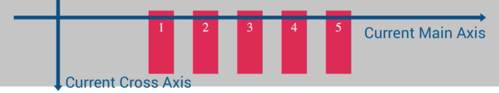
align-items: baseline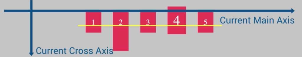
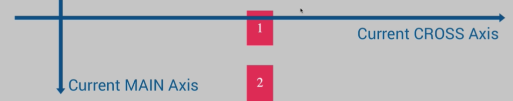
With flex-direction „column“, the Main-Axis and Cross-Axis will changed
flex-direction: column;
align-items: center;
With „column“ the Main-Axis is no longer X, now its Y-Axis. Main Axis now from top to bottom (flex-direction:column) and with the positioning will orientated on Cross Axis (align-items.
flex-direction: column;  //Main-Axis Y from top to bottom
align-items: flex-start; //Cross-Axis X beginning of X Axis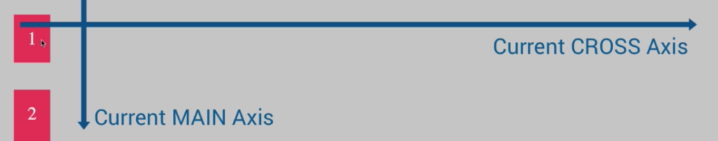
flex-direction: column;  //Main-Axis Y from top to bottom
align-items: flex-end; //Cross-Axis X at the end of X Axis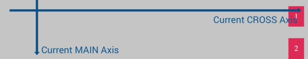
Flex-Items
Property align-self (flex-item) will override the positioning of property align-items (flex-container)
//flex-container
flex-direction: row
align-items: center

//flex-item
.item4{
align-self: flex-end   // only this element will set at end
}

.item2{
height: 130px;
}
//flex-item
.item4{
align-self: stretch   // only this element will stretched
}

.item2{
height: 130px;
}
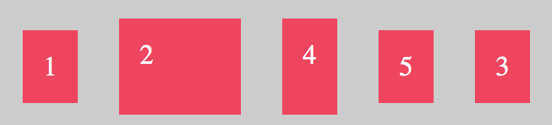
Order Elements
All Elements has initially order number 0
.item4{
align-self: flex-end;
order: -1;
}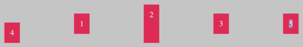
Flex-Grow
Flex-Grow all Elements
That lets grow all elements grow up to maximum
<div class="container">
  <div class="item">1</div>
  <div class="item i2">2</div>
  <div class="item">3</div>
  <div class="item i4">4</div>
  <div class="item">5</div>

</div>
.item{
background-color: #f1425b;
padding: 30px;
margin: 30px;
font-size:40px;
color: #fff;
flex-grow: 1;
}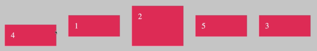
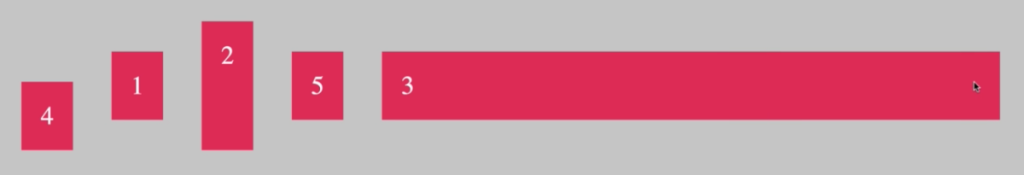
Flex-Grow Single Element
Double Size
//double size of item
.item2{
flex-grow: 2;
}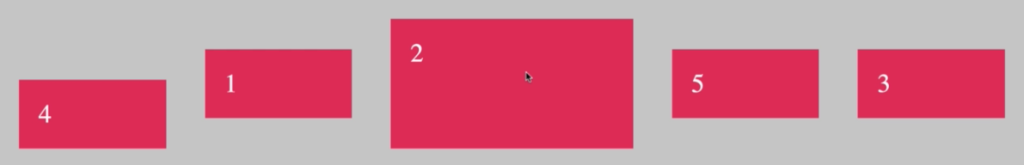
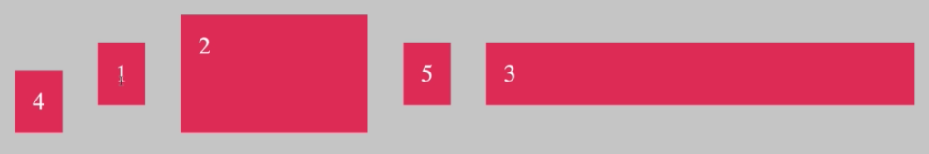
//tripe size of item
.item2{
flex-grow: 3;
}
Tipp: You can also write flex: 3 instead flex-grow: 3
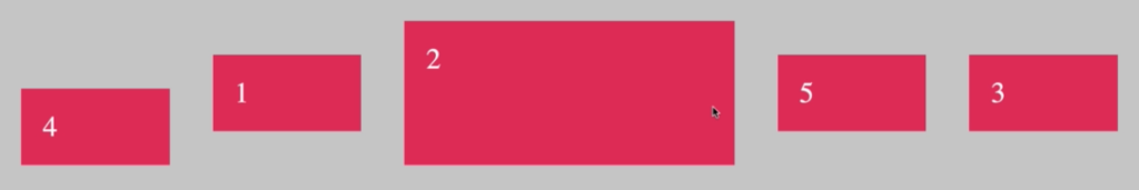
Example only Single Element with flex-grow
.item{
  background-color: #f1425b;
  padding: 30px;
  margin: 30px;
  font-size:40px;
  color: #fff;
 // flex-grow: 1;    //or flex: 1 the same
}
.item3{
 flex: 1
}
Flex-Basis
.item{
  background-color: #f1425b;
  padding: 30px;
  margin: 30px;
  font-size:40px;
  color: #fff;
 // flex-grow: 1;    //or flex: 1 the same
}
.item2{
 flex-basis: 20%;   //or in px
}
.item3{
 flex: 1;
}
Flex-Shrink
With Shrink you can prevented that elements will shrink.
Element 3 has flex-grow so that has ever the full maximum of space, and element 2 has 300px. If i resize window/browser window, the size of element 2 stay fix.
.item3{
 flex: 1;
}

.item2{
 flex-basis: 300px;   //or in %
 flex-shrink: 0;    //dont shrink element

 //alternative like obove
 flex: 0 0 300px
 // 0 (dont growup) 0 (dont shrink) 300px (flex-basis)
}
Align Content in Container
To align all rows or columns in Container you can use align-content.
.container{
  display:flex;
  flex-direction: row;
  justify-content: center;
  align-items: center;

  //flex-start, center, space-between, space-around
  align-content: flex-end;

  background-color: #ccc;
  padding: 10px;
  flex-wrap:wrap;
  height: 1000px;
}